Your search template is the forgotten child of smaller eCommerce websites.
Ever consider why we all heavily use the search option for larger websites? Why do we not take it seriously for our own projects?
It’s not hard. You just need a good developer and a good understanding of your visitors.
You don’t even need the search template from WooCommmerce or Shopify.
In this post, we’ll talk about improving search user experience for your eCommerce websites. I’ll also share the custom systems I’ve created for search criteria.
*Before I start I need to let you all know that Baymard is my go-to for everything related to eCommerce UX. Whatever you’re reading here is a summary of what I’ve learned and tested on Baymard. If you’re serious about user experience, digest all of their resources.
Your filters
Using the proper filters for a search query is always at the top of my list. Depending on the website and product(s), your filters can get complex.
If you’re not Amazon, you can break your filters based on categories.
What do I mean by this?
Nike sells apparel, accessories (for the body), and shoes. Through years of testing, I would say they have a good system for their filters:
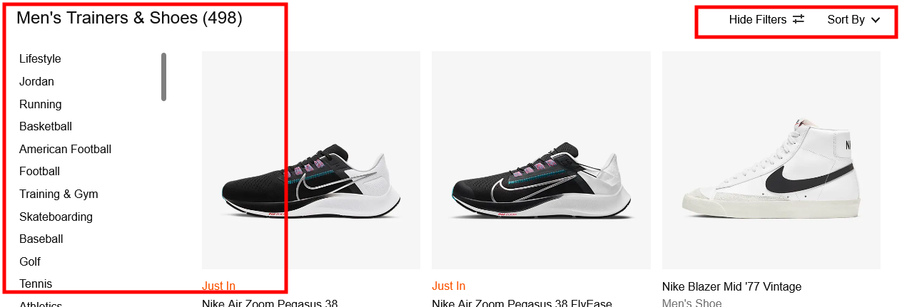
Filter by shoe category (lifestyle, soccer, golf etc.), size, colour, brand, technology, surface, material, shoe height, and more. It’s surprisingly in-depth.
I almost want to say it’s too much, but without diving into their data I can’t jump to conclusions.
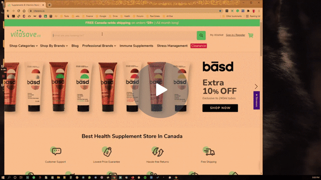
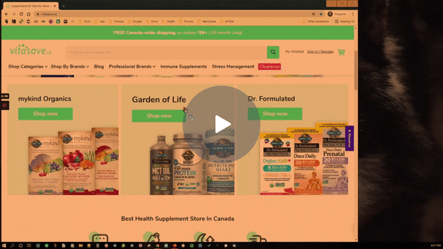
You would be surprised at how many eCommerce websites don’t even think about their filter systems. Let’s use VitaSave as an example.
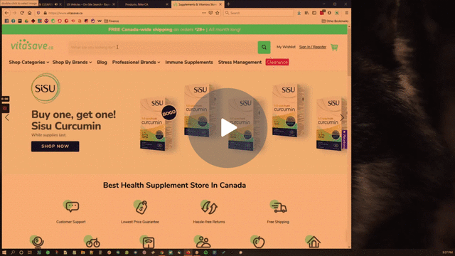
If you look closely at the video above, you can see that if I search for “vitamin C” there are no filters to sift through the 1168 products they offer. After page 3, you just want to give up searching altogether.
Another thing I notice- and something I’ll dive into further into this article- is the display of irrelevant products for every query I enter.
This tells me that the development team did not categorize the products properly.
What would work for VitaSave?
Let’s continue to use VitaSave as an example, and devise a filter strategy on their search template. Take note because you’ll be doing the same exercise with your own eCommerce websites.
Here’s how I would organize the filter system (without having any data to back my hypothesis):
- Brand
- Brand 1
- Brand 2
- Brand 3
- Price range
- Less than $25
- $25-$50
- $50-$100
- More than $100
- Certification
- Organic
- PBA free
- NSF certified
- Potency
- 1-19 g
- 1-400 mcg
- 500-999 mcg
- Package quantity
- 30 day supply
- 60 day supply
- 90 day supply
- 120 day supply
- Formulation
- Multi-ingredient
- Liposomal
- Single-ingredient
You can get more detailed, but this would be a fantastic start for VitaSave. It’s an instant UX improvement.
Please don’t forget to give the option of sorting by relevance, best selling, top-rated, most-rated, and price (high-low and low-high). It’s standard and very easy to implement.
Perfect your filter system. It’s a must. The easier you make it for your visitors to find what they need, the higher the conversion and revenue.
Persist user search queries
33% of desktop sites (44% of mobile sites) force users to re-enter their query after a search has already been registered.
If our job is to create a better user experience, then eliminating that simple re-entry parameter is one simple act we can take.
In the example above from VitaSave, we can see that they’ve followed this UX guideline.
In most cases, users type in several different names for the same product, frustrated that their search isn’t turning up the way they’d hoped. Some visitors may even abandon the search altogether due to the frustration.
Here are a few common reasons why visitors will search 2-3 times for the same product:
- There are too many search results
- There are not enough results
- The results are not what they expected
- They have to reset the search
Like filters, visitors like to make modifications to their search queries. It’s no different than when you’re searching on Google.
Some key suggestions for your search query box:
- Make sure you give the option to clear the search box with an “x”
- Test to see if the search field is easily activated
- Make sure the search query is not too easy to clear
I know it sounds detailed and picky to focus on the search field but I’ve read enough studies to take every element of an eCommerce website seriously. I recommend you do the same.
Including non-product search queries
On many occasions, a visitor will look for “return policy”, “unsubscribe,” or “cancel order,” across your website.
Studies have found that up to 11% of potential buyers abandon the checkout process when they can’t find simple information like a return policy.
Web visitors don’t want to scan your website line by line to find this basic information, so they’ll end up searching for those pages directly. If you don’t have those pages, you may be turning off a big portion of your buyer base.
VitaSave fails with this UX issue as well.
If you have access to a developer, they can do this for you quickly (if you are working with Shopify or WordPress/WooCommerce, this one step should be easy).
While you’re optimizing, consider eliminating pages that attempt to match a user’s queries and interests. Take the visitor to the exact page they’re looking for based on the exact terms of their query.
You can play with the user experience here. Study the search patterns of your visitors and present the information as soon as someone clicks/taps on the search query box.
Here’s a wireframe of what I came up with in less than 10 minutes for the query “headphones,” or “bose”.
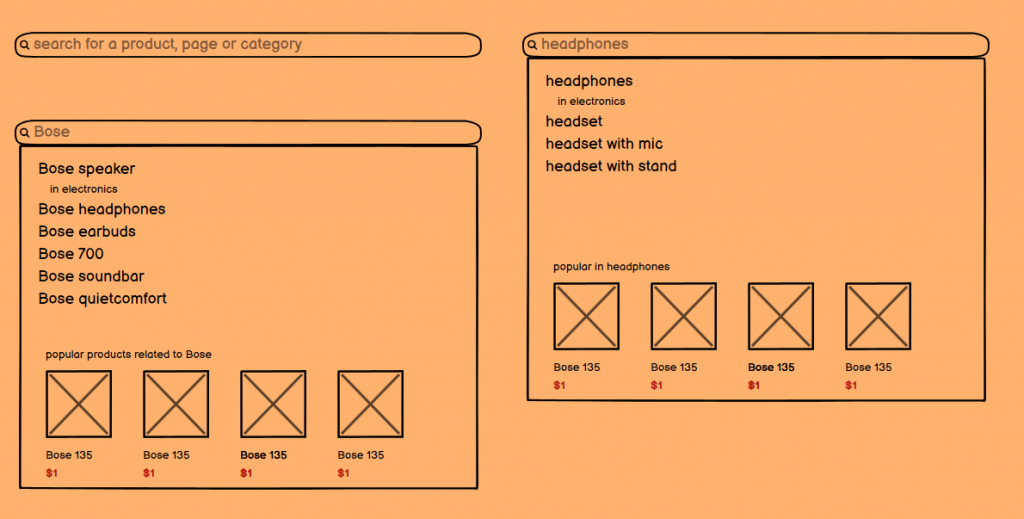
Depending on the keyword, other related queries show up and we get to show popular products associated with the initial search query. This was a quick and simple structure, but you’ll likely change yours a few times before you nail a great search experience.
Specific search queries should match results
What do I mean by matching search queries with variations on the search results page?
If a visitor searches for the term “black jacket”, what you want to do is show all the jackets with the colour variation set to black.
To improve the visitor’s experience further, you want to update the thumbnail based on the search query, if possible.
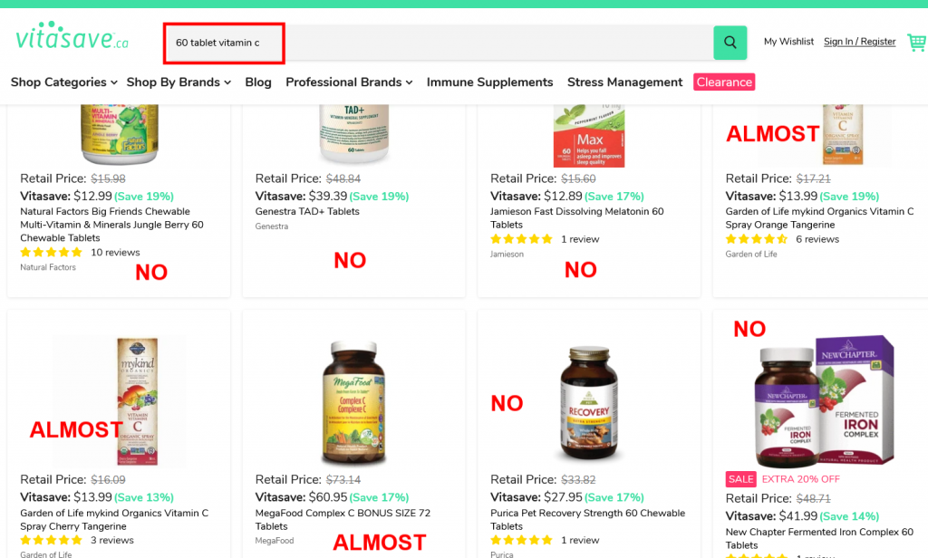
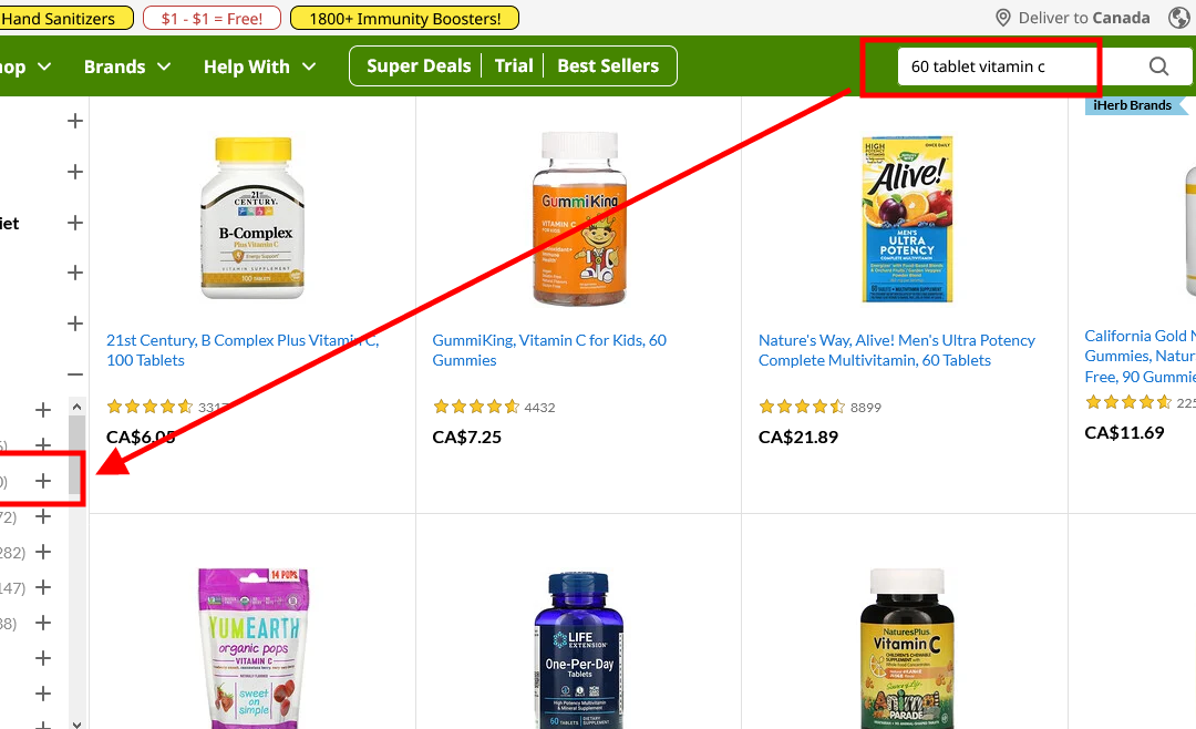
None of my keyphrases match up with search results on the VitaSave site. My primary query is vitamin C with the variation being 60 tablets. But the results that pop up include melatonin, iron, sprays, and multivitamins.
Let’s not forget to auto-apply filters if the variation is available as a filter.
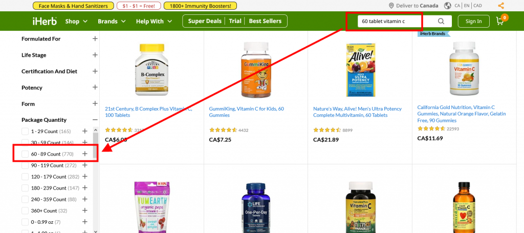
We almost had it with iHerb. The results are better but I still didn’t get containers with 60 tablets or the quantity filter auto-applied.
Through studies, we know that more than 54% of websites don’t incorporate search query variations with their results. Be the other 46%, or better yet, the top in your own industry by applying variations directly in search.
Autocomplete search queries
Let’s now talk about autocompleting a search query to help visitors with their decisions. Most CMS options will give you this option as a standard. The quality of it, however, is not ideal.
Rule #1 – Make sure search query recommendations show up right away.
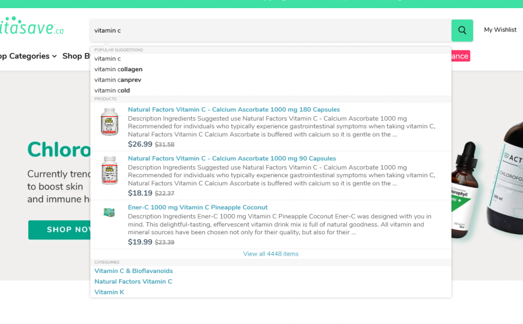
VitaSave does a decent job with this. As soon as I type vitamin C, I get many options right in the search box. Although, I would break up the different categories (creams, sprays etc.).
Rule #2 – With large websites, you want to try giving the visitor the option to select a category. Neither iHerb nor VitaSave has this option. (This feature may not work for every website)
Rule #3 – If a visitor has a “perfect” search query (vitamin C cream), ensure they are directed to the correct category without showing your results page. This rule is also applicable to auto-applying filters to a perfect query.
Rule #4 – Make sure that when a user wants to filter their scope of search for highest rated, low/high pricing or relevance, the results remain consistent.
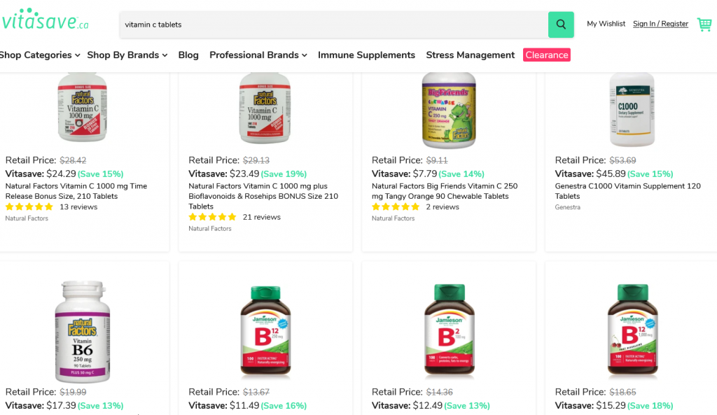
VitaSave does not pass this check since they show vitamin Bs when I search for “Vitamin C tablets”. Again, I don’t have any filters here and cannot narrow my search down to what I actually need.
Approach user experience as the customer and consider where they are at the time of their search. Use that to guide them through a perfect search scope strategy.
As long as you have rules, your developers should not have an issue applying these recommendations.
Your marketing team can then start testing with a target demographic and solidify user experience.
Shipping rates on search
How the shipping price is displayed is crucial to an aware visitor base. In a lot of cases, shipping is free after a certain total amount. In other cases, free shipping is not possible (large items or inaccessible locations).
More than 43% of eCommerce websites miss this step. They assume the visitor will find the shipping rate on the cart or checkout page, which is wrong.
Here are a few places to display shipping rates:
- If it’s a flat rate, display it in the header at the top of the page
- Product pages for visitors to estimate their shipping rates (if there is no flat-rate)
- Search template (if there is no flat-rate)
For the purpose of this article, we’re going to skip how the messaging should be displayed on the header or product pages.
Unfortunately, our example website, VitaSave does not give the option to calculate shipping rates anywhere other than the checkout page. This is simply the worst possible way you can give shipping rates. I have to enter all my information before getting a rate.
Here’s a quick wireframe to get them started:
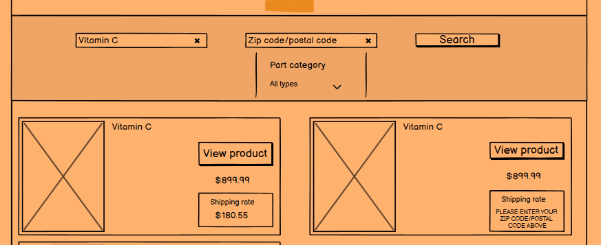
I did this wireframe in ten minutes. If I really wanted to optimize the search template, I would spend a day perfecting it based on what I’ve learned from past user studies.
Contextual search results
Visitors to eCommerce sites have come to expect contextual search results because of their experience on Google and Bing.
Let’s pick on VitaSave some more. If I search for “high quality vitamin C tablets”, I would assume I’d see:
- Vitamin C tablets
- Highest rated vitamin C brands
- Only vitamin c supplements
This could easily apply to search terms like “organic” or “low priced”.
Remember, context is everything when it comes to search. Get it right and you’ll stand out against everyone else.
You’re creating a system to improve and speed up the buying process of your customers. Why would they go anywhere else when you make it this easy?
Practice good design etiquette for autocomplete list suggestions
There are a few best practices for significantly improving the user experience of visitors who rely on autocomplete suggestions.
Rule #1 – Do not suggest more than 10 results. If you do, the person searching will be overwhelmed.
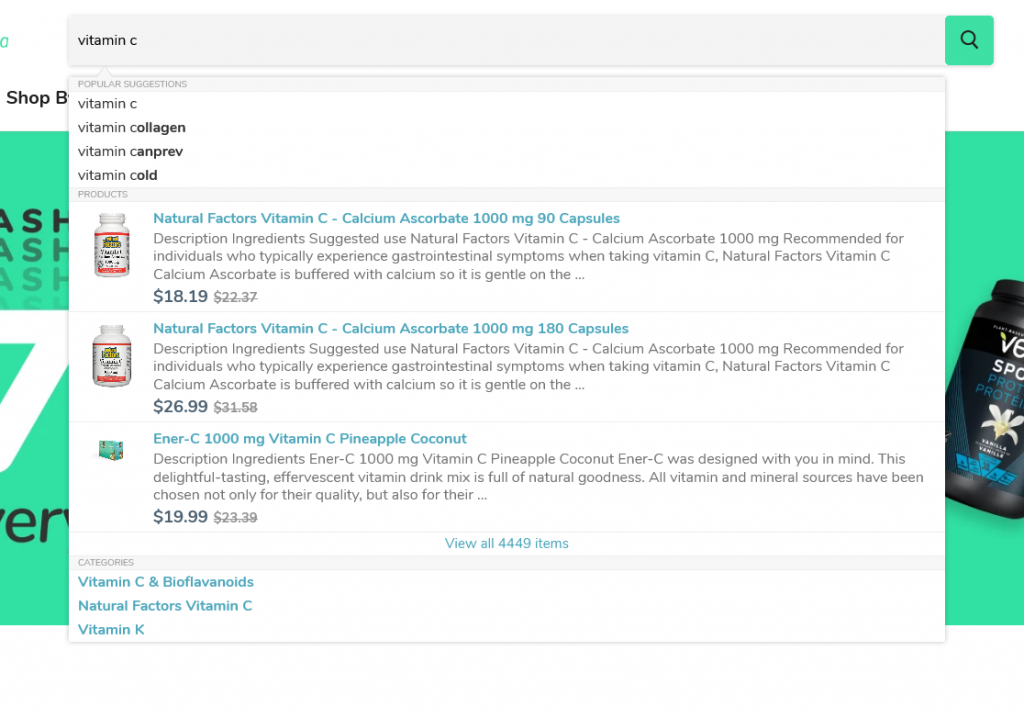
VitaSave passes this rule.
Rule #2 – Make the results are scannable and easy to read. Once again, VitaSave passes this rule.
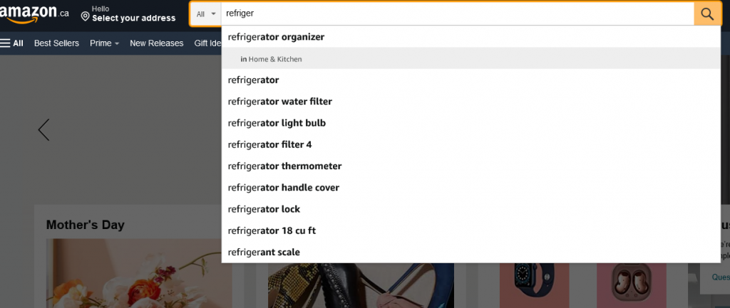
Rule #3 – If you have access to a developer, ask them to highlight related keywords to improve scanability. VitaSave does not pass this rule. Amazon does a great job of this.
Rule #4 – Make sure to avoid scroll bars. That’s just bad design and experience. VitaSave does not pass this rule.
Rule #5 – Highlight the area the visitor’s cursor lands on. VitaSave does not pass this rule.
Rule #6 – Don’t forget visual depth. For example, dim the background when the visitor is typing their query. VitaSave does not pass this rule.
Rule #7 – The search query box should be mobile-friendly (like every other rule). VitaSave passes this rule.
Rule #8 – Searchers should be able to remove the query and continue with the page they’re on easily. VitaSave passes this rule.
Most of your traffic will be from a mobile device. It’s imperative to make it easy to navigate with hand-held devices.
If you follow these eight rules, you’ll be leaps and bounds ahead of your competitors.
Final thoughts
I’ve gone through a lot. There are other obvious measures you’ll need to take to perfect the search experience on your website.
No one has all the secrets. You’ll have to test different ideas to see what works and what doesn’t.
Let me know if I’ve missed anything or if you disagree with the rules I put forward.
Until next time, catch you on my next post.