Table of Contents
Those of you following my progress from the last few posts will notice that I am only discussing updates to our eCommerce website.
There are other projects, but this one is too important and complements our growing YouTube channel.
I will discuss UI and UX updates to our product category pages in this post. The kids call it “collection pages” these days. F’ I am getting old!
SEO is missing from the title. I’ll cover that as well.
I’ve got good news. Not great, but it’s good enough to call it a win.
Let’s get going.
The current structure
The current category page is simple, but more complex than our competitors.
Here’s the structure at the moment:
- We’ve got you breadcrumbs
- Free shipping label
- Guarantee
- Filter system with just brands
- We haven’t dug deeper with our filters yet. That will change with the new version
- We’ve got your category headline
- A way to sort products by price and name (I feel like this is useless in our case)
- Product display
- Image
- Name
- Main specification
- At the bottom of each page, we explain and present why our products are better than the rest of the market
- A relevant video for the category
The design and UI is underwhelming. Although, we’re leaps and bounds better than our competitors.
In terms of SEO, we’ve internally linked to product category pages on our blog, which is doing well. We’re also self-referencing each brand filter so that we show up for brand+keyword (very important).
Simple enough, right? Wrong! A lot has been missed here. I’ll share the improvements next.
UI and UX improvements
In terms of UI improvements, we’ve gone ahead, spread, and rearranged elements on our category template.
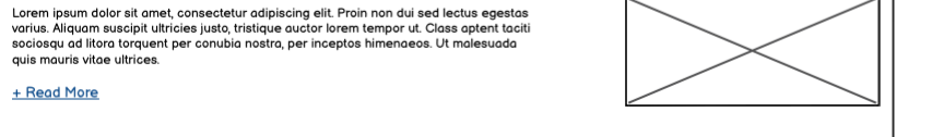
For starters, we had a fairly large paragraph at the top and bottom of our category pages. The UX agency recommended we add a “read more” function.
Our reviews are no longer presented with a plugin. We now have a section with four reviews people can read through. These are, of course, legit reviews from our Google account.
An important suggestion from our UX agency was to remove the “Add to Cart” button from our category pages on individual products. It’s an interesting recommendation. I am not sure how it will do, but it’s worth testing out.
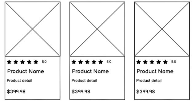
Finally, the grey borders around products have been removed. It looks cleaner now, and I like it.
The goal of the updates from the UX agency is to reduce the amount of visual elements a visitor would have to go over before making a decision. I get what they’re trying to do.
SEO improvements
While I’ve got your attention, let’s go over some of the updates we’ve made in order to improve our rankings:
- We increased the product count to 21 in two categories instead of 12.
- Updated the robots.txt file to disallow a few folders (don’t think this will make a dent).
- Added OEM numbers to product pages on two categories.
- Put new product categories up.
- Improved product pages with new relevant content.
- Included filters of relevant categories within each other.
Baby steps. Incremental improvements will see this website do well over time. Until then, I hope I still have a resemblance of sanity.
Rankings update
On August 13th, I published an article on what we’re doing to improve the visibility of our website. Specifically, we built high authority and relevant backlinks.
It has been longer than a month? Want to see our rankings? Let’s compare the same keywords we’re targeting.
Main keywords
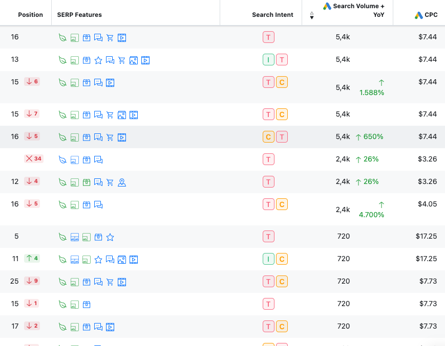
This is depressing as F’. Little to no movement and lower rankings.
Listed parts
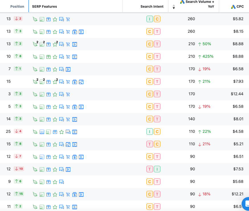
A glimmer of hope? Yes, I believe so. Our products are moving forward and ranking better on all fronts. Not by much, but better.
Would I say that we’ve done better? Not really, but the ranking improvements on the product pages seem to be working.
Revenue numbers
In September, we’ve generated $22k in sales, slightly surpassing our August revenue.
I’ve always been candid about our ambition to reach $100k per month—and I believe we’ll achieve it.
Given the success of our other projects, it’s challenging to see this one not meeting its potential.
Final thoughts
Not much else to report on other than what we’re working on next:
- We’re applying Stripe checkout – I am excited about this change because Stripe has killed it with their offer. Incredible UX and UI. We couldn’t say no.
- Taking more product photos.
- Further improving internal links.
- We’ll reposition product specifications from above the fold to below the fold on our product pages. This tweak could be a game-changer.
The work since my last update has been great. The results? Underwhelming!
Here’s the PDF wireframe for our new category template.
Hopefully, I’ll have better news in time.
Until next time, catch you all on my next post.