Table of Contents
I am not lazy, and I promise you that. I promised myself I would gather my thoughts into a post once a month, but I’ve betrayed myself with that goal.
Although, I’ve been a little defeated with the one website we’ve invested everything into.
Nevertheless, life goes on, and we’ve got to continue improving.
I am stubborn, and if I have to punch myself to get on here to tell you what we’re working on, I will.
From now on, you’ll know what we worked on for the month. I’ll share traffic data, revenue data, what we’re working on, and what we’re planning.
In this post, I’ll talk about improvements to the global navigation of one of our projects. It won’t be long, but you’ll immediately notice user experience improvements.
Let’s get started!
Our current global navigation
I am not a user experience expert. I am interested in the field and eager to learn, but it’s not a specialty.
Based on our call recording data and industry knowledge, we developed the following global navigation and surrounding area(s).

Like any other website, free shipping is critical. That information will always be at the top of our website, homepage, category pages, product pages, cart, and checkout system.
We don’t have more than five links in the global navigation. Eventually, it will be more; when it does, we’ll have to arrange a different way of organizing our links.
Our shoppers like calling in. Because of that, our phone number will always be right by the global navigation. That’s one area I won’t take advice on.
The search section is self-explanatory. It’s prominent and will be necessary sitewide.
Here’s my mistake. The mobile version has everything in the desktop version and is squished like a bucket of hot trash. I should have paid attention, but other work got in the way. It’s embarrassing, and I don’t want to share what it looks like.
Our new global navigation
Our new global navigation is cleaner and tighter. On the desktop version, here’s what it looks like:

As you can see, the phone number is now beside the top bar, the shop all button, search, cart, and accounts are in one row. This might be problematic when we have more product categories. When we have that issue, we’ll likely combine the navigation like big-box stores like Home Depot.
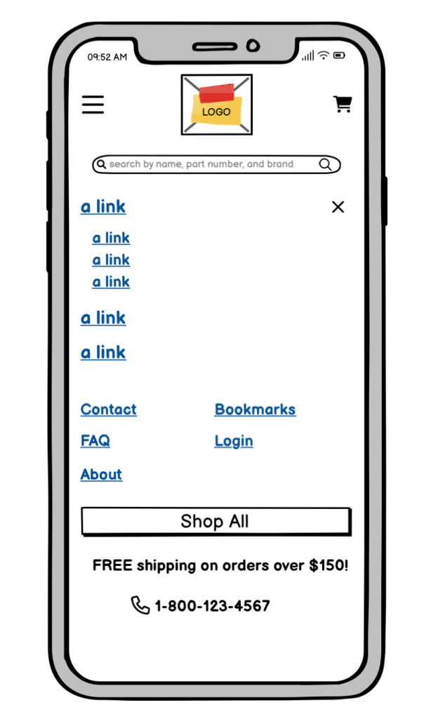
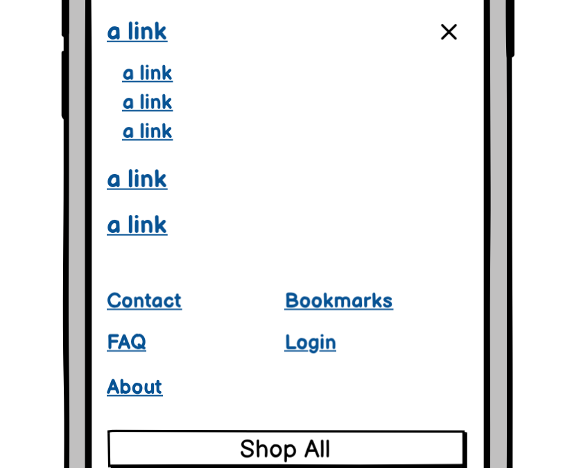
The mobile navigation is also cleaned up.

Again, I don’t want to share what we currently have on the live website for our global navigation on mobile devices. It’s frankly embarrassing. There is zero point in covering it here.
Why are we doing this
We’ve built many successful websites, with this one not being one of them (yet).
I’ve sought outside counsel because of the lack of conversion and rankings. It’s hard to admit since I’ve never experienced anything like this before, but I like the challenge and learning experience.
Our ultimate goal has always been revenue. I don’t care much for vanity metrics.
How do we get there?
- Firstly, I want to ensure I haven’t missed anything by hiring a user experience agency.
- Secondly, our audience is hitting a snag somewhere. It might be with our brand, pricing, or trust signals. We’ll figure it out by crossing everything we think will help.
- I enjoy what I do. All the tests, experiences, and meeting other savages worldwide keep me going.
- Finally, I’ve hired one of the best SEO agencies to consult to get me out of my tunnel.
The global navigation is the first step of many UX updates on this website. I will share other updates over time on this blog.
How are we doing right now
Oof, tough question. I would say, hurting.
Even though I am sure we’ll overtake everyone in the industry, we’re nowhere near where I would like to be.
I won’t waste your time. Let’s get right into it.
Primary keywords
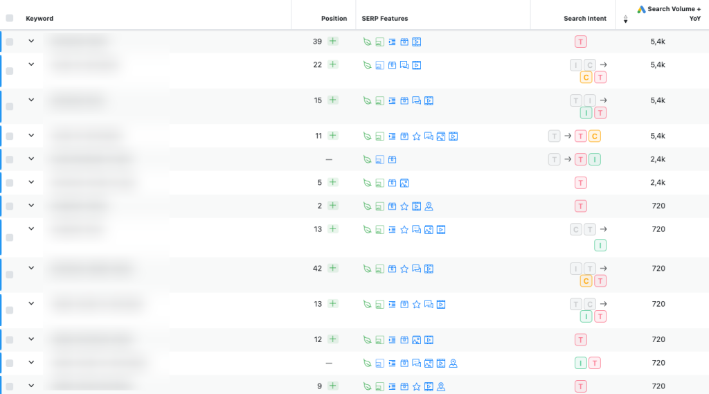
Our primary keywords hover on the bottom of the first, second, and third pages. Some are on the fifth page, nationally in the US.

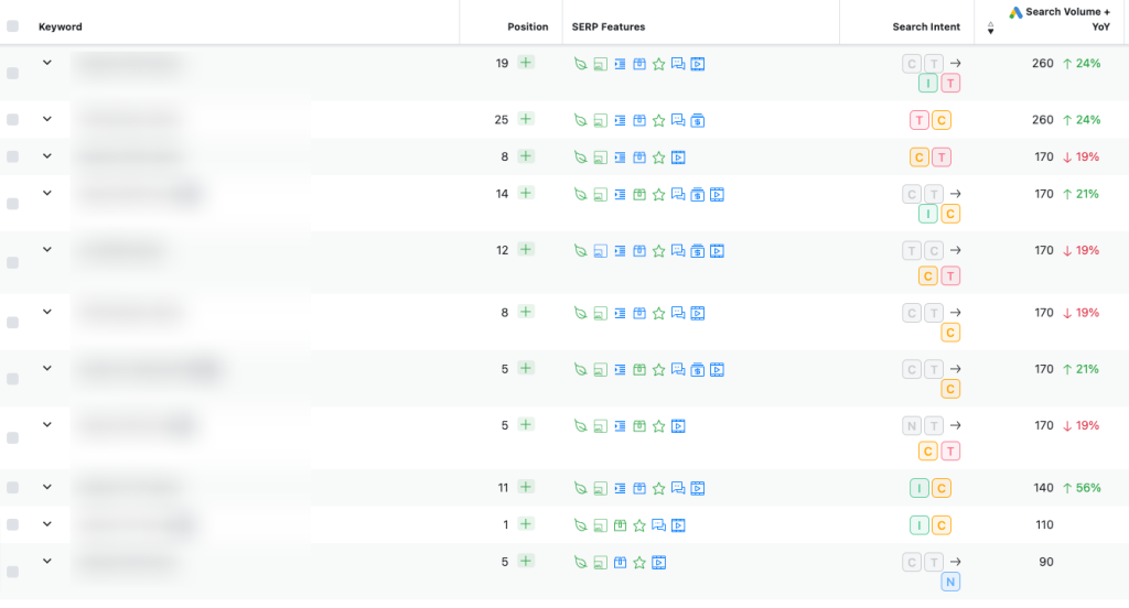
Our product keywords are not doing any better.

Call data
We’ve always dominated call data on all of our web assets, not with this website.

Conversion data
Our conversion data is abysmal at the moment.

Considering the amount of time we spend on this website, these numbers are troubling. Again, we know the potential, so we will not stop.
Google Search Console data
To me, the most important section of our website is any page with “product” in its URL.
This data is for the last 16 months with any URL with the word product. One day, this chart will look parabolic.
Final thoughts
There you have it—a fairly detailed post about how we’ll change our global navigation.
We’re currently working on the following:
- Producing videos to answer PAAs – These videos will be placed on our blog and transcribed.
- Acquiring high-authority backlinks – I am not f’ing around. Our backlinks will be from large authoritative websites.
- We are continuing down the list of suggestions to improve user experience and design.
- We are producing high-fidelity content alongside videos.
- We are working with a technical SEO to improve our rankings.
We have a lot of work to do. We’ll go through high-level work in future posts.
Until next time, catch you all on my next post!


