Part 1, Part 2, Part 3, Part 4 (you’re here), Part 5
In the fourth part of my digital marketing post for orthodontists we’re going to focus on:
- Optimizing the GMB page for Clear Advantage Orthodontics
- Improving information architecture on the homepage
- Talk about design and how it improves credibility
Optimizing Google My Business
I’ve written a detailed post on how you can optimize your Google My Business page. Go over it because it applies to most businesses.
We’re still going to apply advanced tactics to help out Clear Advantage Ortho. Here’s what we can see on Google search:
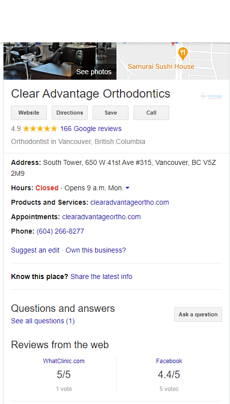
It’s evident that the GMB account has been neglected. Here’s what we can improve right away:
- Answer all your reviews (positive or negative). Dr. Cziraki is definitely well respected. I would expect the staff or marketing team to thank all positive reviews and address all negative comments about the clinic.
- The photos are great but I would add new photos every year.
- Add update the photos of the staff.
- Make sure you add new posts, updates and deals (if any).
- Add videos of the clinic and doctor explaining the services at Clear Advantage Orthodontics.
- Add services offered at the clinic.
These features are available to all businesses through Google My Business. Take advantage of them.
Information architecture
The information architecture of all your pages is extremely important. You can’t just assume you know what your patients want. Especially if you haven’t spoken to them.
Unfortunately, almost all marketing companies cut corners. Their ultimate goal is to rank on Google. They care very little about user experience and pain points.
In the first part of our case study, we went over questions you can ask the staff, doctor and patients. Based on these answers our team will come up with the architecture of the copy and media on every single page.
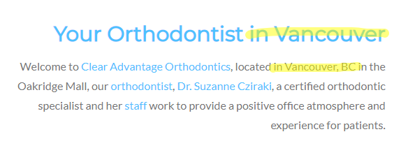
For the sake of time, let’s focus on the homepage. When you look on the homepage for Clear Advantage Orthodontics, you’ll notice your cookie-cutter approach beginner marketers put together to launch a website.
Throughout the homepage, you’ll notice stuffed keywords, a video from Invisalign, obvious stock photography and non-verifiable reviews.
We also know that Clear Advantage Ortho is built on a template. Nothing says I don’t care much for my website when a business owner doesn’t go custom. It’s not really the fault of the business owners. It’s the marketers we need to single out when this happens.
And another example:
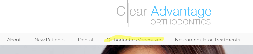
If any of our team members did this to a client website, they wouldn’t be working with us for too long.
Here are some suggestions for the homepage:
- Allow online bookings. It’s almost 2020. There should be zero reasons I can’t book online. The current contact form submission for an appointment doesn’t cut it.
- Clearly state your value proposition at the top.
- Display the benefits of your clinic versus others.
- Make sure there is a video of why Clear Advantage is the choice for your dental needs.
- Share video testimonials of 3-4 customers.
- Show positive Google reviews.
- Most people don’t know if their insurance covers dental work. Talk about that and ensure there is a form for them to send their information to your team to check on their behalf.
- Have a section on your homepage with all your services. A user interface designer needs to be very clever with this part of the homepage.
- Put pictures of the staff right on the homepage. Pictures of the staff are a perfect credibility boost for a local clinic.
Here are three amazing examples of a perfectly executed homepage:
I am not going to take the easy route. Here’s a proposed wireframe for the Clear Advantage Orthodontics homepage. Unless they contact me and hire us, it’s free for all of you to take and use.
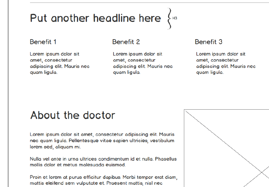
Download the homepage wireframe here.
User interface design
Let’s briefly speak about user interface design. There are hundreds of credible studies on the web with experts who know more on the subject than I do so I will not dive in too deep.
I will, however, go over a few key factors and stats for us to consider when our agency is helping a new client:
- A well-designed webpage converts 150%+ more than a templated page/website. I know this because of our own projects and studies my peers have conducted in different industries.
- Bad design kills your conversion numbers. This is obvious. There isn’t a need to talk about this.
- The top companies in the world spend millions on improving user interface design and experience.
- More and more companies are starting to see the value of UI and UX. You better start now and not get left behind. Have others “try” and copy you. Be the leader now.
- Most people will not recommend a poorly designed website.
User interface design is directly connected to user experience and conversion numbers. If you’ve got your business down to a tee, then do not miss leads with a poorly designed website.
It’s as simple as that!
Final thoughts
This post is by far my shortest post. I know that I’ve covered most of the details in my other posts and don’t need to repeat myself.
However, the new information I’ve written in this post are excellent if you have a clinic. You’ll outclass everyone in your city if you follow my instructions.
Let me know if you have any questions. I’ll catch you all on my next post.